
Visualisation: Application Dashboard
Visualisation: Application Dashboard
Application Dashboard
The Application dashboard for WFH, Retail and Demo editions
Dashboard Overview
Within the proxyNM GUI we display information on application measures. These are application measures that have been run from a proxyNM Agent installed on an end user's computer. Applications can be many things, from storage apps like Dropbox or AmazonS3 where we measure trhoughput of read and write, voice apps where we measure voice quality (MOS) scores or web apps such as CRM, Accounting or ERP where we may measure transaction times.Here is an example of just the top of the dashboard showing navigation and some Amazon S3 results (more result types sit further down the dashboard)
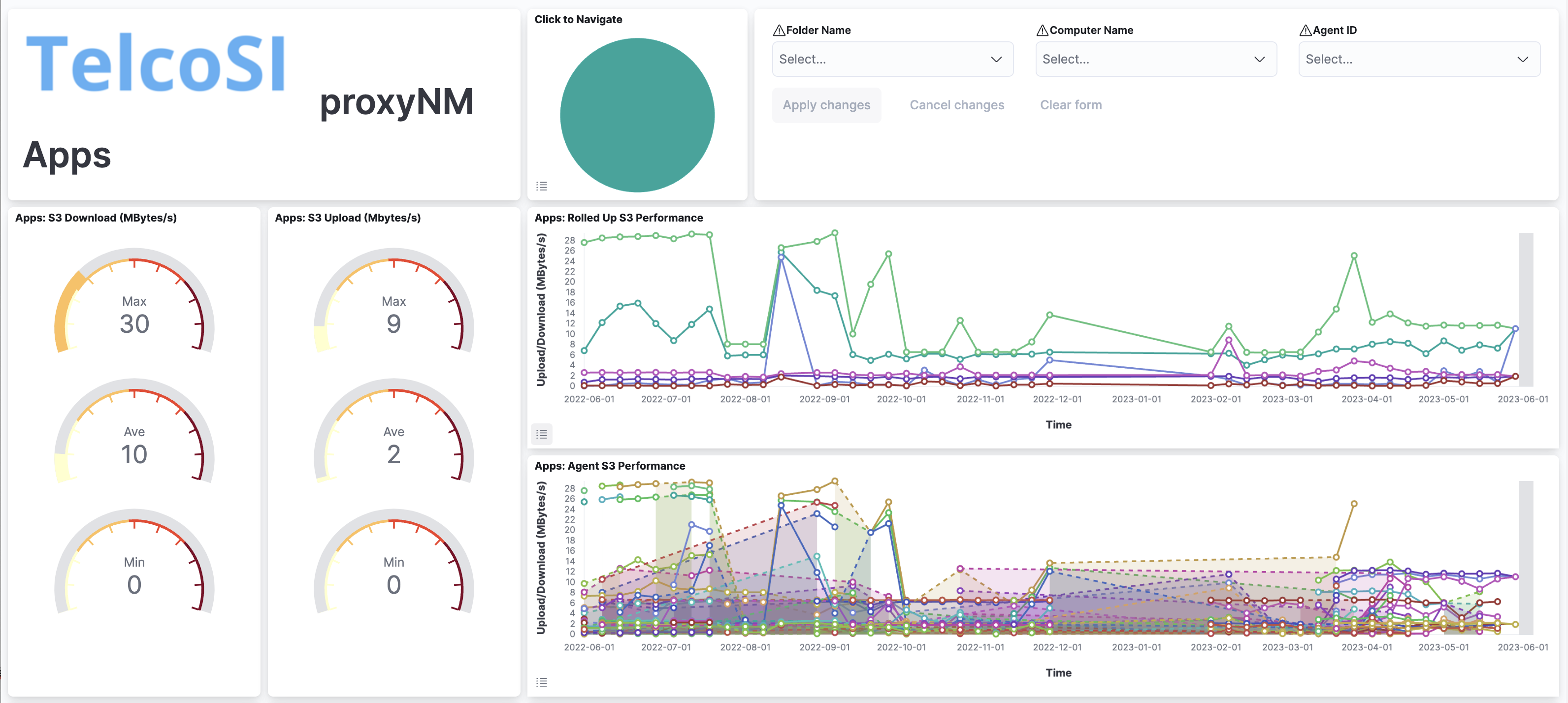
You will see application results rolled up for all of your agents as well as seeing results for individual agents. You can toggle the legend by touching the menu icon on the bottom left of each visualisation. We have toggled the legend in the rolled up HTTP page completion performance results here:
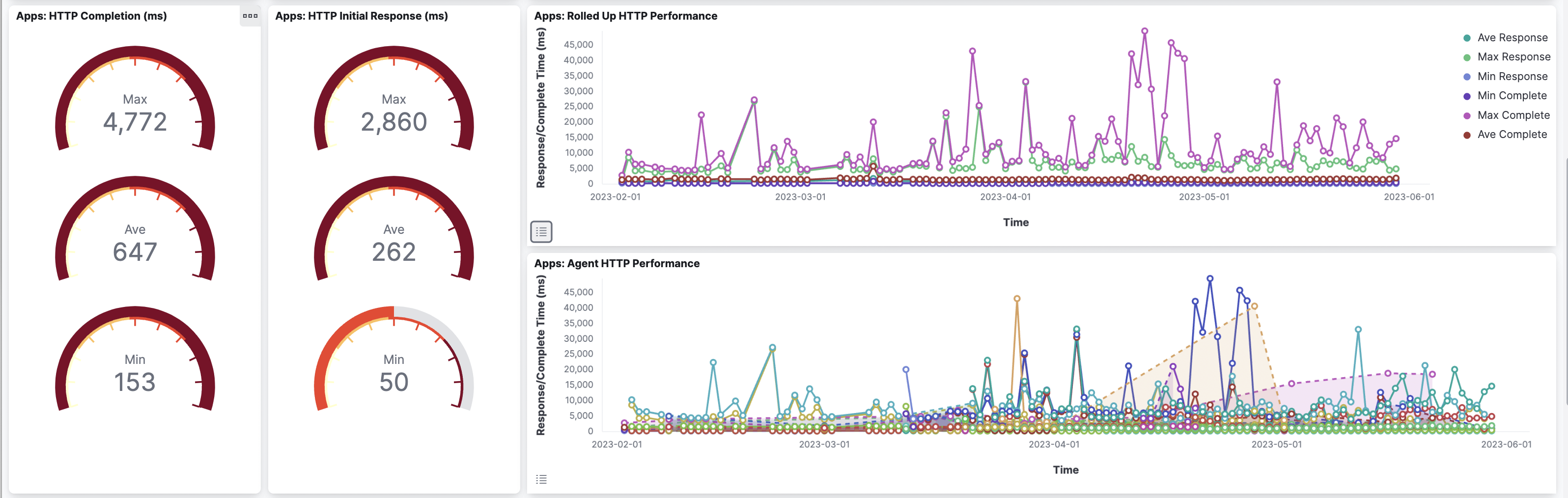
This dual-view approach allows you to spot outliers and compare relative performance which helps when working out if a particular result is good or bad – normal or anomalous.
Generally, results can be seen in a graph over a time period as well as summarised in gauges for the time period selected. For example, you may have selected results for the past week and thus we may show the best, worst and average HTTP page load completion times for that period in gauges, as well as the results plotted over the 7 days. We do this for all agents (a rolled-up chart with series for min, max and average values) and a chart for each agent's results.
Related Visualisations
The standard network dashboard contains visualisations for the following measures:AWS S3 (Download and Upload) - Download and Upload performance to AWS S3 cloud storage
Dropbox (Download and Upload) - Download and Upload performance to Dropbox cloud storage
HTTP Initial Response and Completion - time taken for the first and last byte of test webpages to arrive at the agent
Key Website Initial Response and Completion - time taken for the first and last byte of 'your' key websites to arrive at the agent
Voice Quality - MOS (Mean Opinion Score) scores for send and receive
Streaming Quality - the send (Zoom) and receive (Zoom and Netflix) quality shown against references (Zoom 720, 1080 and Netflix HD SD and Ultra)
Navigation & Filtering
The standard navigation and filtering are available at the top of the dashboard and many of the data series points will have drill-down visualisations.Specifically you can drill down from the:
AWS S3 visualisation charts to the AWS S3 Dashboard
Dropbox visualisation charts to the Dropbox Dashboard
HTTP visualisation charts to the HTTP and Key Website Dashboard or to the Browser Task Speed Dashboard
Key Website visualisation charts to the HTTP and Key Website Dashboard or to the Browser Task Speed Dashboard
Voice Quality visualisation charts to the Voice Quality Dashboard
Streaming Quality visualisation charts to the Streaming Quality Dashboard
Related Posts
Speed, Throughput and Goodput - a discussionStandard Navigation
AWS S3 Visualisations
Dropbox Visualisations
HTTP and Key Website Visualisations
Voice Quality Visualisations
Streaming Quality Visualisation Visualisations
Browser Speed Task Visualisations
Local Network Visualisations
Related reads
TelcoSI are a trusted, privately held Sydney based services and software business. We have been around since 2001. We have always had a focus on IT, telecommunications and on service management.
Our bigger customers include Telstra, Optus, Vodafone, ANZ Bank, ASX. At the smaller end we have builders, lawyers and accounting firms, and many others large and small.
We enjoy what we do. We strive to work with people and businesses that share our optimism for what technology can do to enrich experiences.
We partner with many tech-firms including Apple, Microsoft, Elastic, Google, Dell, HP, AWS, Dropbox, KeeperSecurity and many others


