
Visualisation: Network Dashboard
Visualisation: Network Dashboard
Network Dashboard
The Network dashboard for WFH, Retail and Demo editions
Dashboard Overview
Within the proxyNM GUI we display information on network measures. These are network measures that have been run from a proxyNM Agent installed on an end user's computer. Here is an example of just the top of the dashboard showing navigation and some throughput results (more result types sit further down the dashboard)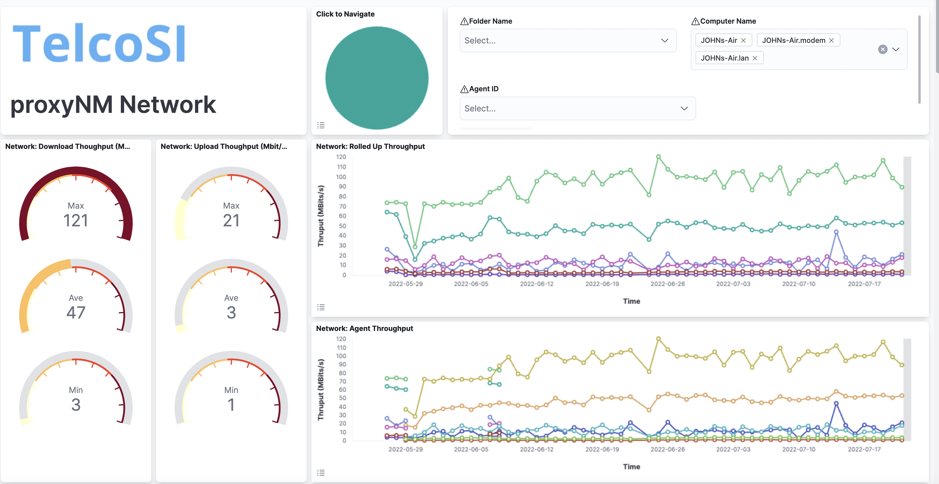
You will see network results rolled up for all of your agents as well as seeing results for individual agents. You can toggle the legend by touching the menu icon on the bottom left of each visualisation. We have toggled the legend in the rolled up DNS performance results here:
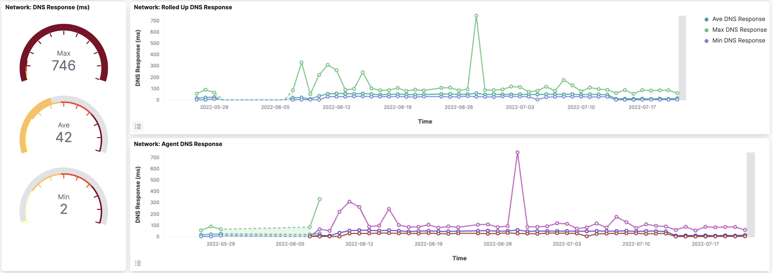
This dual-view approach allows you to spot outliers and compare relative performance which helps when working out if a particular result is good or bad – normal or anomalous.
Generally, results can be seen in a graph over a time period as well as summarised in gauges for the time period selected. For example, you may have selected results for the past week and thus we may show the best, worst and average network loss for that period in gauges, as well as the results plotted over the 7 days. We do this for all agents (a rolled-up chart with series for min, max and average values) and a chart for each agent's results.
Related Visualisations
The standard network dashboard contains visualisations for the following measures:Loss - packet loss to a selection of standard network targets
Latency - round trip delay to a selection of standard network targets
Throughput (Upload & Download) - throughput (actually 'good put' - see the blog article listed below for a discussion)
DNS Response - the performance of DNS lookup using your agent-platform's configured DNS source, not the local DNS cache
Agent Reachability and Uptime - our ability to reach the agent and the network uptime of that agent-platform
Service Providers - the service providers in use by the agent-platform
Local Network Speed - the speed of your local network
Local Network SNR - if local network is WiFI, this is the measured Signal to Noise ratio
Local Network Change Log - a rolling log of changes local network changes to help spot poorly performing local networks or access points
Navigation & Filtering
The standard navigation and filtering are available at the top of the dashboard and many of the data series points will have drill-down visualisations.Specifically you can drill down from the:
Loss visualisation chart to the Loss Dashboard
Latency visualisation chart to the Loss Dashboard
Throughput visualisation chart to the Throughput Dashboard
DNS Response visualisation chart to the DNS Dashboard
Local Network visualisation charts to the Local Network Dashboard
Related Posts
Speed, Throughput and Goodput - a discussionStandard Navigation
Loss Visualisations
Latency Visualisations
Throughput Visualisations
DNS Performance and Availability Visualisations
System UpTime, Agent Reachability and Network Uptime Visualisations
Service Providers Visualisations
Local Network Visualisations

Related reads
Related reads
TelcoSI are a trusted, privately held Sydney based services and software business. We have been around since 2001. We have always had a focus on IT, telecommunications and on service management.
Our bigger customers include Telstra, Optus, Vodafone, ANZ Bank, ASX. At the smaller end we have builders, lawyers and accounting firms, and many others large and small.
We enjoy what we do. We strive to work with people and businesses that share our optimism for what technology can do to enrich experiences.
We partner with many tech-firms including Apple, Microsoft, Elastic, Google, Dell, HP, AWS, Dropbox, KeeperSecurity and many others


